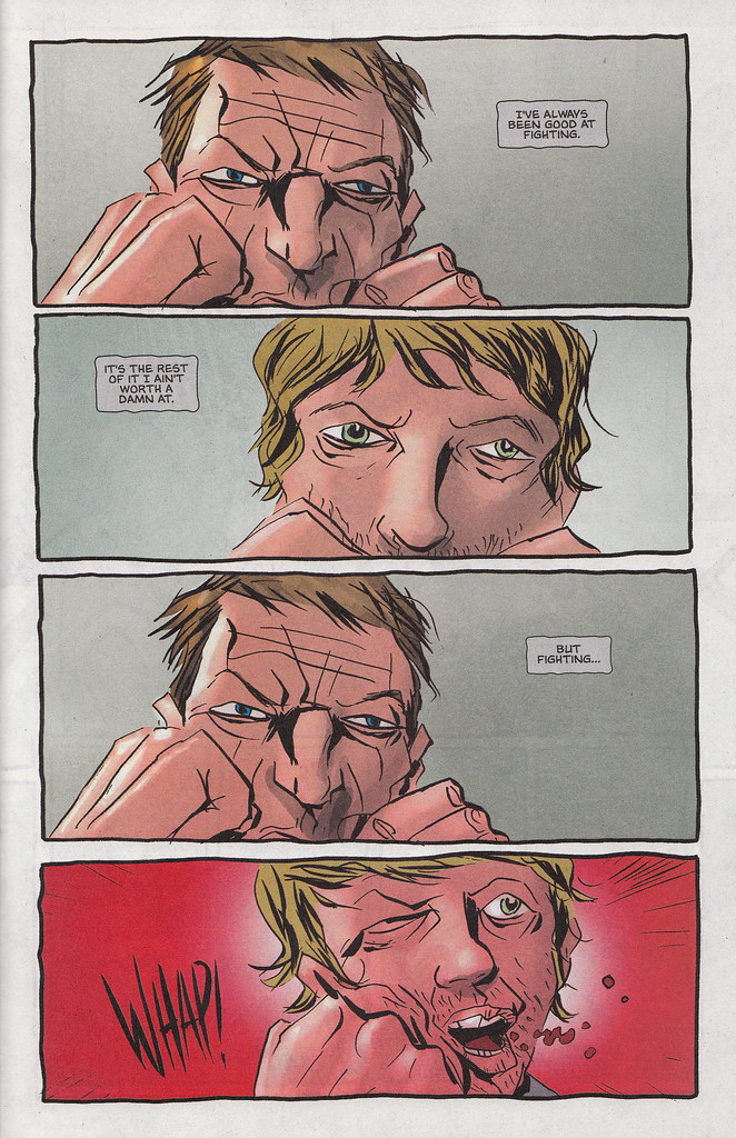
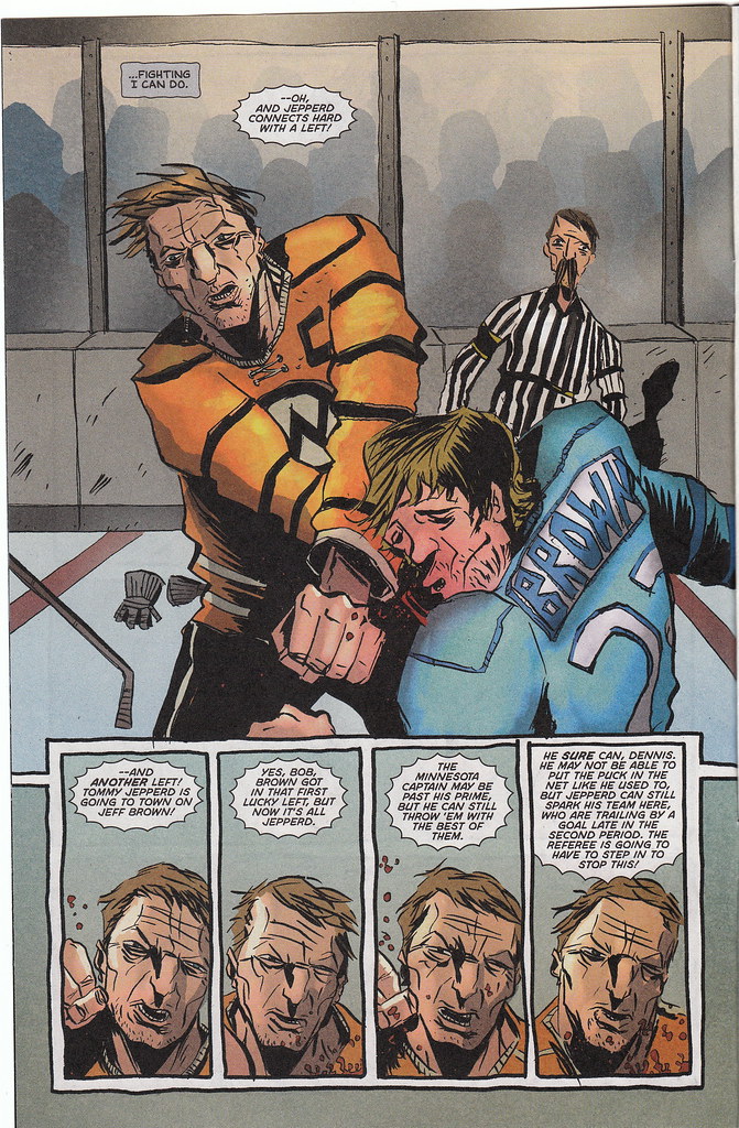
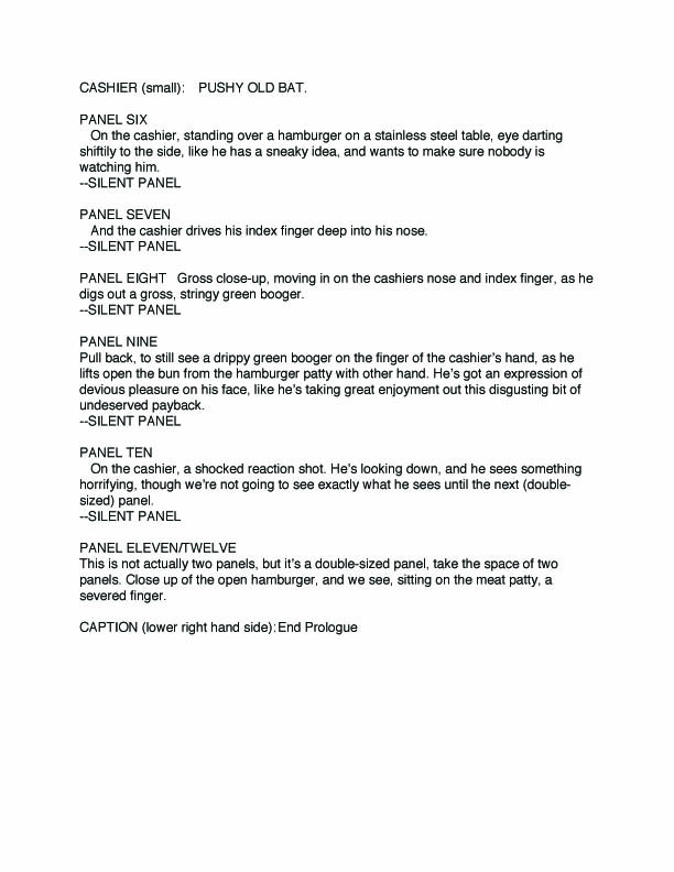
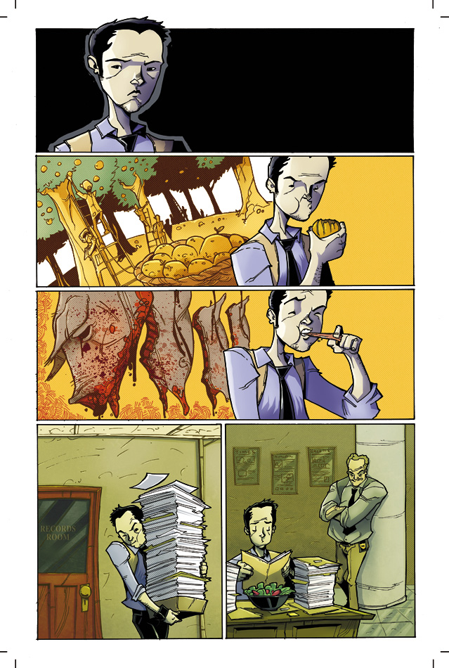
There's a rule I live by, or attempt to utilize from day to day, and it is this: when asked if I like something, and I in fact do, I will never give the reason as "It's good," or "It's awesome," or "I just do." Yeah, there are comics and movies and novels and music that I would love to sum up with, "It's just sooooo good man," and maybe even some of those works could be summed up that way. It seems lazy to me, though, because I really want to understand exactly why I like or love or loathe something.
So what about comics do I love? I'll tell you. Panel progression and inventive panel design. What's that mean? I'll show you!
- • -
Other than containing great stories that may or may not include monkeys or robots, comics are an art form, while at the same time being a craft. They tell me compelling tales, and they do so with panache, baby, they strut across that floor and make sure they're noticed.
It is entirely possible to write and illustrate a comic book that utilizes a standard and straightforward style, while still telling a both compelling and entertaining story. Ed Brubaker and Sean Phillips produced two books - "Criminal" and "Incognito" - that employed straight ahead panel layouts, occasionally relying on a nine-panel grid, which some consider the simplest form of comics (whether they are using simple to mean "easily understood or done" or "of low or abnormally low intelligence" depends on the person, probably). Both of these books contain stories that are rich with character development, but also include plenty of "geeky" moments as well. They are great examples of how writers and artists can grab the reader's attention without getting too fancy. Alan Moore and Eddie Campbell do this in their book "From Hell," each panel either being a square or a rectangle. Another good example is the book "Fell," which is illustrated by Ben Templesmith - and written by Warren Ellis - using the nine-panel grid. All of these showcase how a straight ahead layout can still be used to tell interesting stories. That's what is so great about comics though: they can be anything the artists want them to be.
Someone out there might argue that comics are a genre, and not a medium. I've personally never heard anyone trying to make this argument, but I've read interviews and articles where it's been mentioned. There's no better proof that comics are in fact a medium than the demonstration that so many different techniques can be used to create them. Now, thanks to two amazing writer/artists, we're going to look at exactly how comics can step out into the broader field of creativity.
- • -
First up is artist and writer Alex Robinson, known for books such as "Box Office Poison," "Too Cool To Be Forgotten," and his latest, "A Kidnapped Santa Claus." Mr. Robinson was kind enough to supply Hideous Energy with two pages from his original graphic novel "Too Cool To Be Forgotten," which is the tale of a middle-aged man being put under hypnosis only to wake up back in high school.

This page is a perfect example of interesting panel progression, layout, and an expert use of perspective. All of these things offer comic book artists (and writers) ways to render their stories unique.
Here we see the main character, Andy Wicks, undergoing hypnosis in order to quit smoking. Along with panel progression/layout, another big aspect of comic book writing and art is the layout of dialogue bubbles. The reader's eye travels from right to left, and works its way down the page in this manner until the page is finished being read. That's not really too complex of an idea, and certainly isn't one most regular comic book readers are unfamiliar with. Looking at this page, however, there's another interesting observation to make, which is that Robinson's art was laid out in a way to help lead the reader's eye downward.
Another interesting technique Robinson uses here is evident with the two cutaway panels placed over the larger panel that serves somewhat as a background. They help the reader with a concept that can be notoriously hard to convey within the realm of static images: time. Showcasing time passing - or any form of motion - is somewhat difficult using nothing but still images. Robinson addresses the problem wonderfully though. The first panel shows the reader what Andy Wicks sees, a point of view (POV) shot, allowing their minds to switch perspectives long enough that a feeling of time passing occurs. The second panel, of the eyes narrowing and becoming heavy with sleep, is a great piece of storytelling in that it is there to be compared - whether consciously or subconsciously - with the version of Andy's eyes shown at the top of the page. The difference between them is obvious, and because of this the reader can tell he is becoming sleepy. Again, that's somewhat simple, but it is something that happens so subtly - sometimes - that a reader can be unaware they are even filling in these gaps. Robinson manages to show us Andy Wicks becoming hypnotized with nothing more than three panels and some dialogue.

There really isn't too much that has to be said about this page. Along with creating the art with only words, the story is furthered by the dialogue written. Both of these pages are examples of how page design can influence a story, and how the use of creative techniques offers endless roads for writers and artists to travel within comics.
This page is so wonderful because although there isn't a conventional illustration, there is still story taking place; Robinson has merely shifted the panel progression from the page to your imagination. It's pretty hard to read the words written and not picture anything. This is either a side-effect of reading a comic and the brain balancing between left/right brain function - which is some deep, psychology stuff - or because Alex Robinson is doing his job. Either way, you should do some studying to figure this out.
- • -
These next two pages were supplied by writer/artist Jeff Lemire, known for his books "Essex County," "The Nobody," and his current ongoing title for Vertigo, "Sweet Tooth." Both of the pages are taken from "Sweet Tooth," and showcase examples of how panel progression plays a huge, but subtle role in the creation of comic books.

The first page is taken from "Sweet Tooth" #4, and the second is taken from issue #14. The first observation that can be made is that the pages are very similar, showing the characters posed similarly. If anyone is reading "Sweet Tooth" this helps further an idea Mr. Lemire presented in issue #14, and one that has surely been hinted at leading up to the currently developing storyline.
Other than the story and character implications evident, another notable aspect of both pages is Lemire's use of panel progression. If counting the larger image as a panel, there are six panels total, all static images that perfectly allow the reader to see the characters in action, swinging their respective weapons.
 More than any other tool in the artist's bag, panel progression is utilized to show motion. Here it is used in conjunction with sound effects to help the reader understand that each smaller panel represents a separate strike, showing that both characters are repeatedly bashing their enemy. Picture the page with only one sound effect, a single word punctuating the very last panel, and the story changes slightly from an ongoing struggle to a shorter altercation.
Without panel progression it would be difficult for our minds to see the passage of time within static images, and these two pages make sure that's understood.
- • -
All of these pages show what comics are capable of, but they are a small glimpse into the huge variety of examples out there. Check out all of Alex Robinson's books to see more, along with Jeff Lemire's as well.
And the next time someone tells you that comics aren't a medium - if that's ever happened - then point them in the right direction to see about changing their minds. It might not always work, but at least you'll be able to offer up some solid evidence.
Thanks again to Alex Robinson and Jeff Lemire for helping out with this article, and supplying their fantastic artwork.