Showing posts with label art. Show all posts

Thursday, September 15, 2011

Making the Comics - A Peek Into Super Cute

Even though we don't talk about it too often, David and I continue to operate Hideous Energy exactly as it was operated the day it began. Our love of comics has never waned, and we are the right kind of obsessive to ensure that it won't. It was only natural that after so long of loving something so completely we would decide to create our own, an object of adoration that would be born from and exist within the ruby-tinted love we huddle around every week when we record the Hideous Energy podcast.

What all of that means is we started a webcomic called Super Cute. There's some information on that site under the "About" tab which touches on this briefly, and gives a little insight into how things came about. The even shorter version is that we found Brent Hibbard, our artist, and things seriously fell into line pretty easily after that. I've been struggling with getting comics made for some time now. I only write them (although right now I'm working on "drawing" one too), so no matter how much time I've put into a project, seeing it come to fruition has always relied on someone else. Super Cute is officially the first comic I've been involved in making, because it's the first that has not only been started, but completed. Which means I've had a lot of starts and stops over the years. Something happened with this one though, something different. Once Hibbard sent us his art, and David and I both saw he was awesome, he started working to become the artist of this project and he never stopped. His commitment was never in doubt because it was on display in every image he sent us. It is sort of laughable how much everything worked exactly like it should in the run-up to this webcomic being published, once we found our artist.

The first official strip is up on the website. Here's the strip that was originally going to be published first, strip #000. It didn't rehash any information we'd already published through the "Characters" tab on the site, but it did give readers another week to wait until the actual stories about these two characters (Bronson and Leonard) began. So we don't feel like we asked Brent to draw something only to file it in a drawer, here is the finished strip, entitled "#000 - Diagnostics," along with a breakdown of the process on the road to a completed strip. Thanks to Brent for being dedicated and awesome! Go check out the webcomic.

Wednesday, March 9, 2011

Eerily Accurate - Muppet Life


We're taking a brief week off to get some things in order for our 25th show. We are quite freaking excited, so stay tuned and see what we have up our sleeve.

In lieu of a show this week, however, we present you with this totally righteous picture by Liz Suburbia. This is her idea of what it looks like when we record the show. It actually isn't this cool, because neither David nor I have a rocking-ass James Spader poster. Thanks to Liz Suburbia, yet again, for being one of the coolest people out there. We recently got a chance to read her comic zine "Cyanide Milkshake #2," and it's a blast of fun and and awesome things. There are humans with new heads, zombie apocalypse sex, crazy advertisements; reading it is sort of like flipping through the really cool channels in your brain. Thanks again to Liz (who we usually just call Suburbia)!

Wednesday, February 9, 2011

Comic Twart Continues To Be Awesome

If you've never checked out the Comic Twart, you should go do so now. It is a continual parade of interesting and amazing art, and should be a regular stop on your daily internet wanderings. Recently I saw this picture, by Evan Shaner, and it reminded me why I love comics. Check it out.


This is only one of the awesome entries by the Comic Twart artists doing their interpretations of the Ghostbusters. Francesco Francavilla has a great, clickable piece to look at as well, so check that one out too. Comics rule.

Friday, December 10, 2010

Art - The Word and the Concept


This is a - shit, the name for it hasn't really been determined yet. There are plenty of labels one could throw onto it, but the technology that allowed it to come into existence has temporarily stunned language into this still zone where the silence is really the buzz of everyone talking at once.

That, ladies and gentlemen, is an image created on an iPad. It's something that isn't obvious at first, but after you find out the information your brain lurches over into understanding. Upon looking at it closer you can see the wide swathes the digital brush tools left behind as artist Sean Phillips brought this image to life. Did he paint it? Did he draw it? What the hell did he do exactly to make this piece of art exist?

If the biggest problem is the inability to label something, then everything is okay, right? Also, trying to wring some sort of philosophical discussion out of this points toward the obvious answer when someone asks themselves about the future of the world (comic book or otherwise); Will we be okay? This image gives us the answer.

Yes. Yes we will. There are gorgeous iPad - shit, let's call it a painting - paintings that exist which prove everything will be fine. These paintings prove that there are artists working within the comic book industry who elevate the form to a level of majesty and beauty worthy of that one huge word, the one co-opted by anyone with an opinion or a feeling, that sometimes scary word; art.

Whether you embrace or reject technology, or the idea of comics as art, this is a joy to look at. Phillips even posted a time-lapse video of the painting coming into existence. I suggest you go watch it. If it made me react like this, who knows what it'll do to you.

-Austin

Monday, October 25, 2010

Art Bomb!

Here's an explosion of art. This shrapnel is to be left in your brain, to infect your likes and dislikes.

"Jonah Hex" by Sean Phillips.


"Surf" by Fred Chao.


"Deer Winter" by Jen Wang.


"Goblin Knoll" by Marian Churchland.

"Goblin Knoll 2" by Marian Churchland. 
Make sure you check out all of the artists' websites by clicking on the caption beneath the art. There's even more good stuff posted there.

Saturday, October 23, 2010

Look At This! You Can't Not!

A little bit ago - maybe a month or so - I started thinking about the superhero books I read currently, and what they mean to me in relation to all the other content I pour into my brain. Even though my realization was slow, almost tentative - like I was somehow scared about its implications - it became clear that the only superhero book I read on a regular basis is "Invincible," by Robert Kirkman and Ryan Ottley.


This is a cover by Ryan Ottley, featuring the character Dinosaurus. It's a perfect demonstration of the book's goofy fun side, which is a large reason I keep coming back. Somehow Kirkman and Ottley are creating a book that works on two levels, though, because it isn't all over-the-top nuttiness. Alongside making me feel and think about superhero comics the way I did when I was younger, it also offers up content that I can relate to now.

Issue 75 is about to come out, and Ottley posts on his blog about how it took two months to draw because it is the length of two books. If you haven't read "Invincible" by now you should start. They have some very awesome over-sized hardcovers that are packed with extra content and awesome stories. Go find them.

Monday, October 18, 2010

Paying Too Much Attention: Panel Progression and Design

There are an innumerable amount of reasons that comics are awesome. Some of the reasons are slightly hard to articulate - the obsession with monkeys? - and it can be hard to explain exactly why they rock so thoroughly to someone who doesn't read them.

There's a rule I live by, or attempt to utilize from day to day, and it is this: when asked if I like something, and I in fact do, I will never give the reason as "It's good," or "It's awesome," or "I just do." Yeah, there are comics and movies and novels and music that I would love to sum up with, "It's just sooooo good man," and maybe even some of those works could be summed up that way. It seems lazy to me, though, because I really want to understand exactly why I like or love or loathe something.

So what about comics do I love? I'll tell you. Panel progression and inventive panel design. What's that mean? I'll show you!

- • -

Other than containing great stories that may or may not include monkeys or robots, comics are an art form, while at the same time being a craft. They tell me compelling tales, and they do so with panache, baby, they strut across that floor and make sure they're noticed.

It is entirely possible to write and illustrate a comic book that utilizes a standard and straightforward style, while still telling a both compelling and entertaining story. Ed Brubaker and Sean Phillips produced two books - "Criminal" and "Incognito" - that employed straight ahead panel layouts, occasionally relying on a nine-panel grid, which some consider the simplest form of comics (whether they are using simple to mean "easily understood or done" or "of low or abnormally low intelligence" depends on the person, probably). Both of these books contain stories that are rich with character development, but also include plenty of "geeky" moments as well. They are great examples of how writers and artists can grab the reader's attention without getting too fancy. Alan Moore and Eddie Campbell do this in their book "From Hell," each panel either being a square or a rectangle. Another good example is the book "Fell," which is illustrated by Ben Templesmith - and written by Warren Ellis - using the nine-panel grid. All of these showcase how a straight ahead layout can still be used to tell interesting stories. That's what is so great about comics though: they can be anything the artists want them to be.

Someone out there might argue that comics are a genre, and not a medium. I've personally never heard anyone trying to make this argument, but I've read interviews and articles where it's been mentioned. There's no better proof that comics are in fact a medium than the demonstration that so many different techniques can be used to create them. Now, thanks to two amazing writer/artists, we're going to look at exactly how comics can step out into the broader field of creativity.

- • -

First up is artist and writer Alex Robinson, known for books such as "Box Office Poison," "Too Cool To Be Forgotten," and his latest, "A Kidnapped Santa Claus." Mr. Robinson was kind enough to supply Hideous Energy with two pages from his original graphic novel "Too Cool To Be Forgotten," which is the tale of a middle-aged man being put under hypnosis only to wake up back in high school.

This page is a perfect example of interesting panel progression, layout, and an expert use of perspective. All of these things offer comic book artists (and writers) ways to render their stories unique.

Here we see the main character, Andy Wicks, undergoing hypnosis in order to quit smoking. Along with panel progression/layout, another big aspect of comic book writing and art is the layout of dialogue bubbles. The reader's eye travels from right to left, and works its way down the page in this manner until the page is finished being read. That's not really too complex of an idea, and certainly isn't one most regular comic book readers are unfamiliar with. Looking at this page, however, there's another interesting observation to make, which is that Robinson's art was laid out in a way to help lead the reader's eye downward.

Another interesting technique Robinson uses here is evident with the two cutaway panels placed over the larger panel that serves somewhat as a background. They help the reader with a concept that can be notoriously hard to convey within the realm of static images: time. Showcasing time passing - or any form of motion - is somewhat difficult using nothing but still images. Robinson addresses the problem wonderfully though. The first panel shows the reader what Andy Wicks sees, a point of view (POV) shot, allowing their minds to switch perspectives long enough that a feeling of time passing occurs. The second panel, of the eyes narrowing and becoming heavy with sleep, is a great piece of storytelling in that it is there to be compared - whether consciously or subconsciously - with the version of Andy's eyes shown at the top of the page. The difference between them is obvious, and because of this the reader can tell he is becoming sleepy. Again, that's somewhat simple, but it is something that happens so subtly - sometimes - that a reader can be unaware they are even filling in these gaps. Robinson manages to show us Andy Wicks becoming hypnotized with nothing more than three panels and some dialogue.

The next page from "Too Cool To Be Forgotten" is somewhat more experimental than the first example, and is a great example of how comic writers and artists can do fantastic and experimental things.

There really isn't too much that has to be said about this page. Along with creating the art with only words, the story is furthered by the dialogue written. Both of these pages are examples of how page design can influence a story, and how the use of creative techniques offers endless roads for writers and artists to travel within comics.

This page is so wonderful because although there isn't a conventional illustration, there is still story taking place; Robinson has merely shifted the panel progression from the page to your imagination. It's pretty hard to read the words written and not picture anything. This is either a side-effect of reading a comic and the brain balancing between left/right brain function - which is some deep, psychology stuff - or because Alex Robinson is doing his job. Either way, you should do some studying to figure this out.

- • -

These next two pages were supplied by writer/artist Jeff Lemire, known for his books "Essex County," "The Nobody," and his current ongoing title for Vertigo, "Sweet Tooth." Both of the pages are taken from "Sweet Tooth," and showcase examples of how panel progression plays a huge, but subtle role in the creation of comic books.
The first page is taken from "Sweet Tooth" #4, and the second is taken from issue #14. The first observation that can be made is that the pages are very similar, showing the characters posed similarly. If anyone is reading "Sweet Tooth" this helps further an idea Mr. Lemire presented in issue #14, and one that has surely been hinted at leading up to the currently developing storyline.

Other than the story and character implications evident, another notable aspect of both pages is Lemire's use of panel progression. If counting the larger image as a panel, there are six panels total, all static images that perfectly allow the reader to see the characters in action, swinging their respective weapons.

More than any other tool in the artist's bag, panel progression is utilized to show motion. Here it is used in conjunction with sound effects to help the reader understand that each smaller panel represents a separate strike, showing that both characters are repeatedly bashing their enemy. Picture the page with only one sound effect, a single word punctuating the very last panel, and the story changes slightly from an ongoing struggle to a shorter altercation.

Without panel progression it would be difficult for our minds to see the passage of time within static images, and these two pages make sure that's understood.

- • -
All of these pages show what comics are capable of, but they are a small glimpse into the huge variety of examples out there. Check out all of Alex Robinson's books to see more, along with Jeff Lemire's as well.

And the next time someone tells you that comics aren't a medium - if that's ever happened - then point them in the right direction to see about changing their minds. It might not always work, but at least you'll be able to offer up some solid evidence.

Thanks again to Alex Robinson and Jeff Lemire for helping out with this article, and supplying their fantastic artwork.

Tuesday, September 7, 2010

Pulp Fiction

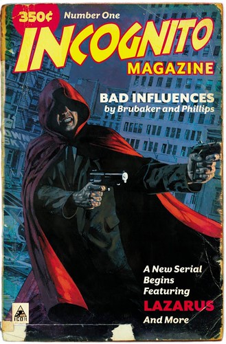
Incognito 2 - Variant

Artist Sean Phillips did this variant cover for the first issue of the second volume of he and Ed Brubaker's amazing series "Incognito." I will definitely bay 350 cents to read it.

Dinosaurs and President Lincoln - Evan "Doc" Shaner

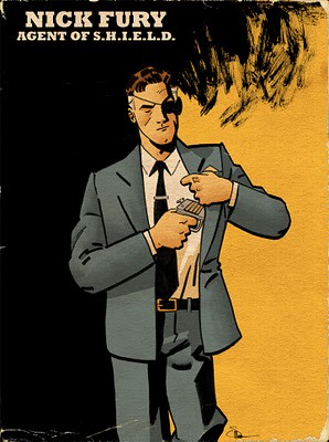
NickFury, by Doc Shaner

Waaaay back when, I'm going to say in April, I conducted an interview with the artist Evan "Doc" Shaner. He's completely freaking awesome in every way, a'la Mary Poppins, and you can find his art on his blog, Comic Twart, and his DeviantArt page, and I give you my word that it is all fantastic.


Various things happened between then and now that rendered me mentally incapable of posting this interview, but rather than giving excuses I will just shoulder the blame completely. It's my fault, and Mr. Shaner has been completely understanding and awesome - again - about the whole thing. So here, finally, is his interview, with some brief words from me beforehand.


- • -


Fact: Evan "Doc" Shaner is a good artist. His style exists somewhere along the lines of "cartooning," but putting a label on it detracts from the sheer fun each image evokes. This guy is absolutely someone to watch, and I am confident sooner or later his name will be one of those household varieties. Currently he has it listed on his blog that commissions for September are open, but there's only one spot, so maybe read this interview after you go sign up for a commission. The art featured here was either posted on Comic Twart ("Sandmen") or his blog (everything but the "1990 Gettysburg" banner, which can be found here).Thanks again to Evan.


- • -


Hideous Energy: First up, where'd you get the nickname "Doc?"


Evan Shaner: "Understandably, most folks think it's because of Doc Savage. While I like the character, I didn't even know anything about him until about a year or two ago. My father's a music teacher in the school district I grew up in, and my middle school band director called him "Doctor Shaner" for no real reason. Somewhere along the way he started calling me Doc and it stuck with the other kids."


HE: How long have you been drawing?


ES: "I've been drawing for as long as I can remember. As a kid all I ever wanted to be was a newspaper cartoonist, but when I started getting into music in high school I just stopped drawing as often. Somewhere in college I got the bug again and started thinking about it seriously as a career. I took a couple art classes and lucked into the staff cartoonist job at the university's newspaper and I've been drawing since."


Walking Dead by Shaner

HE: What instrument did you play in high school?


ES: "I played trumpet and piano. I went to college as a music major for the first two years. After two years of it it dawned on me that they didn't have the kind of degree I was looking for and at the same time I was more into cartooning. I still play regularly but I certainly enjoy it a little more now that I don't view it as a job."


HE: What's a normal day like for you?


ES: "I usually get up around 9AM and go to bed somewhere between 12AM and 2. The better part of the morning is spent answering whatever e-mails need immediate attention and then walking our dog. I'll work the rest of the afternoon until my wife gets home around 5, have dinner and hang out a little, and then go back to work. Right now I'm splitting time between commissions and pages."


HE: On your blog you list yourself as a "dinosaur enthusiast." So what's your favorite dinosaur?


ES: "Probably somewhere between the Triceratops and the Stegosaurus. I can't pick just one, they're all interesting. My brother and I had every dinosaur toy we could get our hands on as kids, because seeing that kind of stuff and being told it actually existed is mind blowing to a kid. T-Rex, Brontosaurus (or Apatosaurus, whatever they're supposed to be called), Pterodactyl; those are all cool but I remember seeing pictures of Triceratops and just thinking that was wild because it didn't look like anything else to me."


HE: I remember finding out about dinosaurs, and seeing pictures, and not knowing what to think. At some point I wondered how the artists knew what color the dinosaurs were. What if the T-Rex was actually neon-pink? Stuff like that.

ES: "I used to think about that stuff all the time. For all we know they were all covered in feathers and heads in the middle of their chests."


HE: Your blog has some art from a project called "1990 Gettysburg." What is that exactly?


1990 Gettysburg

ES: "1990 Gettysburg is kind of a joke journal about myself when I was 5 and my imaginary friend Abe Lincoln. When I was a kid everybody had their imaginary friends, and not wanting to be left out I said that mine was Lincoln because I couldn't come up with anything original. I mentioned this one year when I participated in Hourly Comic Day, and liked it so much I kind of put it to the side as something I wanted to revisit later. After getting out of college I stopped doing humor comics for a while and after a year or two of it I was really itching to write some humor stuff. I decided to dig up that concept and called it 1990 Gettysburg because I was 5 years old in 1990 and as a kid I thought the Gettysburg address was where Abe Lincoln lived. So technically "1990 Gettysburg" is a street address. I haven't been able to work on it recently, but I'm dying to do some more when I get the chance."


HE: Okay, I'm going to urge you to immediately begin work on a "1990 Gettysburg" book.


ES: "It's something I really want to get to at some point, no matter what the format. I love doing the comic book stuff, but my heart will always be in newspaper strips. That medium took up a great deal of my childhood and is a large part of the reason I'm doing any of this."


HE: You contribute to a blog called "Comic Twart." What exactly is a "comic twart," and how did you become involved with them?


ES: "The Comic Twart started on Twitter (Twitter + Art = Twart). Declan Shalvey, Mitch Gerads, Chris Samnee, Tom Fowler, Mitch Breitweiser, and myself started using the same themes for daily sketches to the point where we were writing each other on Twitter and deciding the next day's theme. Within a day or two, someone suggested putting a blog together to post everything on the same page, and Chris and his wife Laura were nice enough to set up the whole thing. Then very shortly the group ballooned to 16 guys, all of which are extremely talented artists that I'm very proud to be associated with."


"Sandmen" by Doc Shaner.


HE: That sounds like a great creative exercise. Have you ever used the site to help you get past a creative roadblock?


ES: "It is a great exercise. I'm not sure that I've used it to break mental blocks, but it's definitely helped me stretch creatively. Plus, the best thing about the way we've done it so far is it really pushes all of us to do something new. Francesco's usually the first one out of the gate on any given week, and from there we're all trying to top him and each other."


HE: Aside from your personal blog, Deviant Art page, and the Comic Twart blog, where can someone who likes your art find more?


ES: "As of right now the three you mentioned is about it. I'll occasionally post thumbnails and roughs through Twitter but for the most part there isn't usually a whole lot of finished stuff."


HE: Would you say the internet is a valuable resource for an illustrator now? I saw on your Deviant Art page you had some problems with idiots using your art without your permission; do things like that ever make you want to pull back? Abandon the blog and lessen the online presence?

ES: "The internet is absolutely a valuable resource for an illustrator, but like everything it has its ups and downs. I've made connections in the last two years that would have been impossible without the internet, connections that have allowed me to keep doing this and grow as a professional. The downside is occasionally your work will be taken and used for t-shirts or what have you, and unfortunately that's a risk you take when you post art on the internet. I've only had it happen to me twice now (that I know of) and both times it's been resolved amicably, but I know that it's not always that easy. The best you can do is try and keep on top of those kind of things, as long as it doesn't take up too much time. The problem is obviously I don't own most of these characters so it's tough to come at it from a legal standpoint, but most of the time these guys are ripping off the folks who own the characters too. I'm definitely more careful now about which work I post and how I go about it. It can be a mixed blessing and one of those issues that's still kind of problematic concerning how things are distributed online."


HE: "What's the illustration process like for you? Do you use a lot of digital tools, or are you more old school?

ES: "I try to spend as little time on the computer as possible. It's nothing against technology, my eyes just tend to hurt after staring at a computer screen for too long, so I try to do as much without the computer as possible. It all depends on what's right for the piece in question. Nearly everything is penciled and inked traditionally, then scanned and colored in photoshop. I work in ink wash and watercolor as well, but like I said it depends on what I'm working on at the moment."


HE: Do you have anything in the works that readers can expect on comic shop shelves?


ES: "I'm working on a couple things right now, one of which I'm not sure how much I can talk about. I've also been working on something with the guys at Mysterious Adventure Magazine, who have been very patient with me and my schedule. Things are just starting to ramp up right now so at the moment I'm in the process of figuring what I can get done in the coming months."


HE: Are the pages you're working on Top Secret Stuff?


ES: "The pages I'm working on currently are for a short story in JAM! Tales from the World of Roller Derby. It's not that it's a big deal secret, I'm just not sure how much I'm supposed to be saying about my involvement in it."


HE: Would you say you've already "broken in" to the industry?

ES: "That's a tough thing to quantify. I'm getting work at a couple well-known publishers, but that doesn't necessarily mean I've "broken in". Certainly compared to a couple years ago, or even one year, I feel a lot more rooted in this community. I've met and talked with a lot more folks in the industry, all of which have helped me further my career. So I guess that's my long winded way of saying I'm not sure. It may be a while before I could even begin to know."


HE: Conversely, do you view yourself as an "up-and-comer?


ES: "Again, I'm not sure. That's up to other people. In that I haven't been doing this long I suppose I could be labeled as such, but it's really not up to me. That's for publishers and readers to decide."


HE: What's the most difficult aspect of illustration for you?


ES: "The concept stage. Part of the luxury of getting to draw all day without having a specific gig all the time is I've got the time to work out technical problems. So now it's mostly the design aspect of whatever I'm working on. Not that I've got the technical part down 100%, but I definitely spend more time on the concept."

Monday, September 6, 2010

ART!!

Sometimes you have to yell it like that. Because the art makes you. Because it's so good. And really, art can be good for a number of reasons, a huge list of factors that are unique to every person. Surely some of my reasons behind my opinions might cross over and match up with any number of readers/viewers out there, but I love that they won't always.

Here recently I got into writer/artist Brandon Graham, who is most famous for a book he did called "King City." It's a freak-fest of a fun time where there are people called "Cat Masters" who utilize one of the deadliest weapons on the planet: cats. These people can use cats to do anything by injecting them with specialized serums. Anything.
Sadly the book is in some form of limbo since the original six issues were published as a volume through Tokyopop, and are now being re-published through Image. I've tried to order the comics through Diamond Distributors, but found they only have issues two, five, and ten in stock. Yeah, so it's a battle to read these things right now. Hopefully after Graham finishes the twelve issue run Image will publish a new collection, and it will be easier to read this awesome series. For now though, here's a poster Graham did for the back of the last issue.

King City Poster

Wednesday, May 12, 2010

Your World Is Normal

I know I've posted about this previously, but this panel is too gorgeous to let pass. If you aren't reading "Sailor Twain" by artist Mark Siegel, look at this and change your mind.


2010-05-12-SailorTwain_058

Thursday, April 22, 2010

Keep Your Eyes Open

Thanks to "Popgun: Volume 1" I've started discovering new writers and artists, and so far one of the few who has stood out has been Nick Derington. I checked out his stuff online, and came across this picture.

carcrash01

Classifying things - or people - by comparisons to other things or people has always been a pet peeve of mine, both because it can subtract a certain amount of originality, and also because I can't always avoid doing it myself.

For instance, this picture up here shows that Derington's art is somewhat reminiscent of Darwyn Cooke, and the story inside "Popgun: Volume 1" is vaguely similar to John Romita Junior. None of that really matters though. I know I like how this looks, and the rest of his stuff as well.

Wednesday, April 21, 2010

Now That's Batman

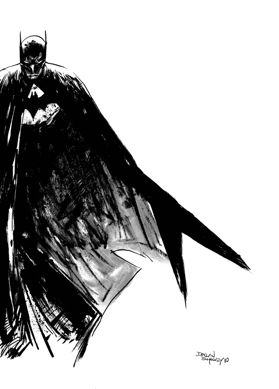
declan_batman

Yep. This is almost like artist Declan Shalvey went into my mind and picked out a version of Batman. You can check out this picture and more over on Comic Twart.

Monday, April 19, 2010

A Trip To C2E2 (Scroll For Pics)

This previous weekend was C2E2, or the Chicago Comic and Entertainment Expo. I had been to a con recently, a year ago maybe, but it wasn't a major convention like this one. The ride there had me thinking other con experiences, and that this one would be somewhat like the first visit to a convention I'd ever had. Mostly this idea was rooted in C2E2's history, more specifically that there is none. It was hard to tell this was only the first year for the con, but that isn't to say there weren't things they couldn't have improved, but I don't necessarily care about any of that.

What I care about are the books.

- • -

The comic shop I work at isn't huge, but it is great. We're limited by our location, but we make due with what we have; it's a cliché, but that statement is more about utilizing the resources you can than it is about compromising. One of the worst limitations we have to deal with is the location of new material. When the new books are announced/released the internet can sometimes tell us, but it doesn't always. There is still a certain amount of searching that has to take place, and even then there are no guarantees.

Going to C2E2 was always about fun. There is constant motion when you're there, you're going going going, and your eyes occasionally get overloaded with things to see. Riding to Chicago, I decided this trip would be a search. A search for books that aren't known to everyone, for writers and artists that don't have the benefit of a giant company and its public relations minions. There is always something to find, and this year my convention was a successful outing when regarded like this. Also, fun.

There are definitely going to be reviews of things I bought there (as well as interviews with creators, hopefully on here and on the Alter Ego Comic Cast), and other content as well.

- • -

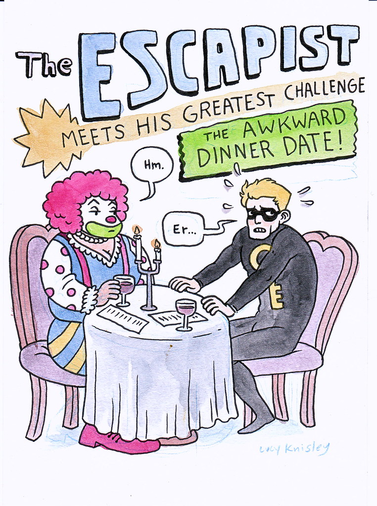
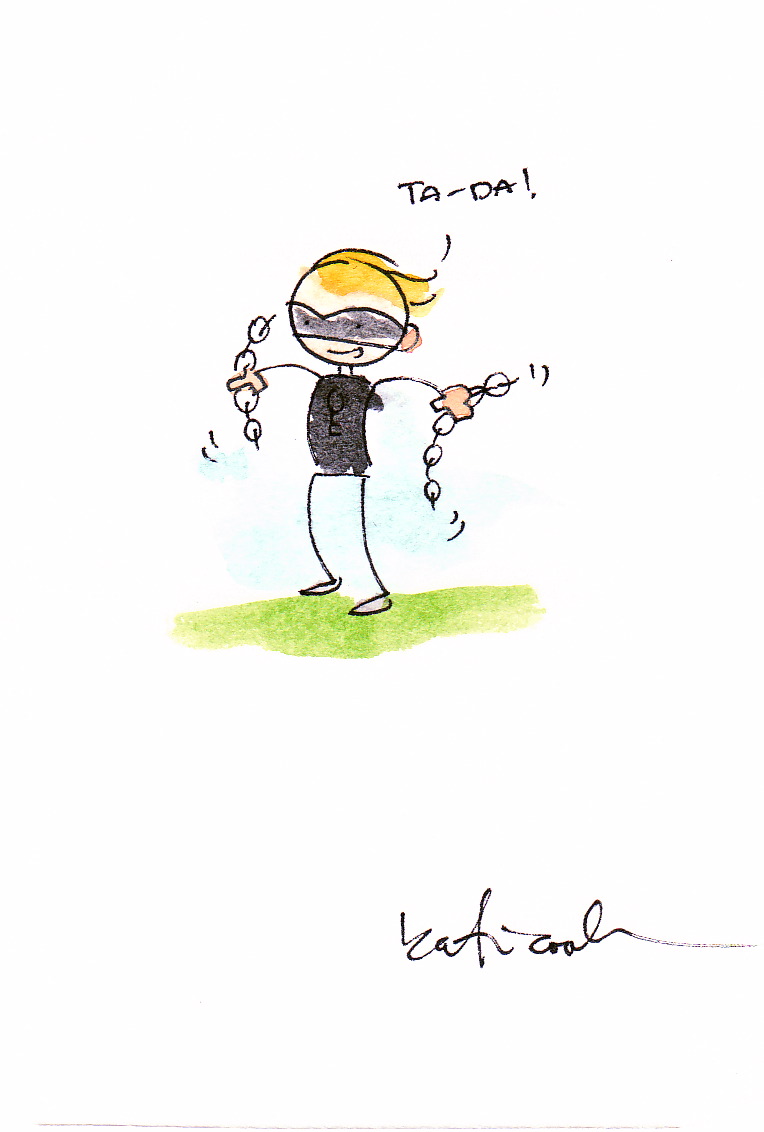
I got the opportunity to meet Lucy Knisley, who did an interview right here at Hideous Energy, and also supplied the blog with its first title card. She was awesome, and did two amazing sketches for me. I was pretty nervous about meeting her, because I've followed her blog for a while now, and am a HUGE fan of her art. So yeah, when I went up to meet her my words sort of dried up, but that wasn't the worst part. My face got red, like an instant sunburn, and my forehead started sweating like I was using a blowtorch as a fan. Hopefully she wasn't too creeped out by me. Maybe if I ever meet her again I can be a little less awkward and weird. Here are the sketches she did for me.


DuckiesEscapist

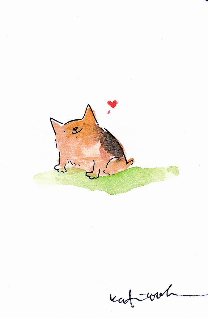
Artist Katie Cook was one of my discoveries. I had heard of her, but never looked at too much of her art before. She was offering mini-water color sketches at her booth, and you could basically say almost anything to her and she would draw it. Reference photos helped though, and I happened to have a couple. She also had some already finished, such as the "Mouse Guard" picture I got. Here are the sketches.

EscapistLieamDucky


Thanks to Lucy and Katie, and all the rest of the writers/artists I met and talked to over the weekend. More to come later.

Thursday, February 18, 2010

Sweet Tooth - Script and Pages *UPDATED*

It's nice and safe out there. Pressed up against the exterior of our doors and windows is a world that won't turn on us at any second. Danger does exist, but it isn't as prevalent as the world Jeff Lemire (pronounced Luh-meer) has created in his comic book "Sweet Tooth."

Along with being post-apocalyptic - which already means its a notch above our world when it comes to danger - there is a crazy chance if you're a child in the "Sweet Tooth" world you will be a weird human/animal hybrid, like the title character, "Sweet Tooth" (real name Gus), who happens to have antlers growing out of his head.

Lemire's stories are not sunny, so don't go into reading something of his hoping for a reason to start your toes a'tapping. Loaded with melancholy, Lemire's works are often dark and downright sad.

Issue number six of "Sweet Tooth," which was recently published by Vertigo Comics, is a great example of a spot occupied on the emotional spectrum by the majority of Lemire's work. It is soul-crushing; it will make your face scrunch up, your eyes feel heavy, and possibly even add a little quiver to your lip.

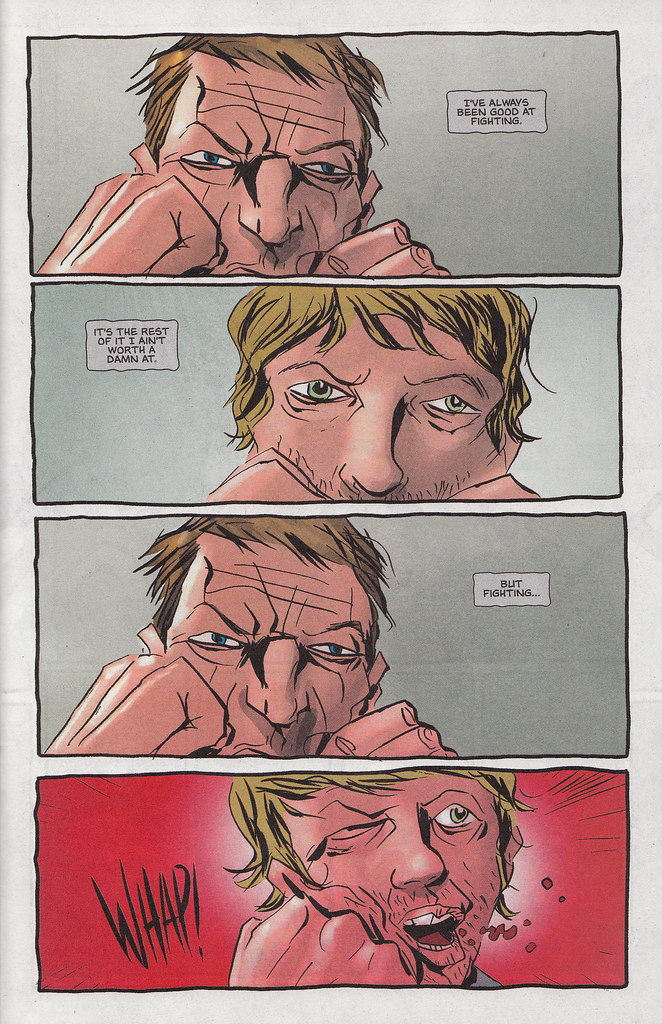
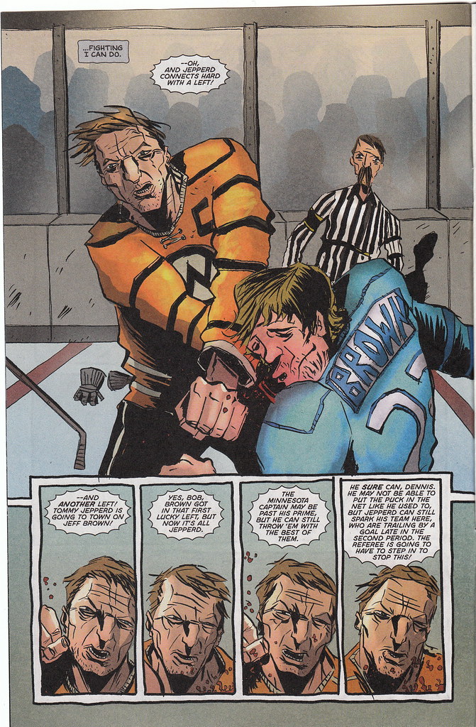
And it is the most fun I've had being sad in a little while. Lemire writes and illustrates the comic by himself, so it is basically all his (except for the colors, which are done by the great Jose Villarrubia). Mr. Lemire was kind enough to supply me with the script for issue six, and with his permission here are two pages from that script, along with the corresponding pages from the issue. For a really interesting comparison of craft and how the process of comic book creation is different for everyone, look at these pages first, then check out John Layman's scripts and the finished pages, illustrated by Rob Guillory, of his comic "Chew" here.

Since Lemire takes care of both writing and illustration duties on "Sweet Tooth" his scripts are much looser, and contain way less panel description than normal scripts. This is demonstrated nicely by how the line "...fighting I can do," is relocated to page two in the final comic, while within the script it is located inside panel four of page one.

*UPDATED*

After reading the comment about why Jeff Lemire may write full scripts for a comic he both writes and illustrates, I contacted Mr. Lemire and asked.

"Originally I did just write the scripts for editorial purposes, as I was used to working much, much looser, with just a detailed outline. But I found as I got into a few issues of Sweet tooth that the detailed scripts actually helped me to organize my thoughts and break down my outlines. I actually thumbnail as I write the scripts now, and it really works for me. Especially with a set page count that I have to work within each month. I guess the scripting process helps most in terms of writing dialogue. Once you get into the flow of of the writing the script it helps the dialogue come out more naturally."

He went on to explain the difference between versions of his scripts, particularly the variations in drafts, saying, "Of course I am always tweaking and changing my script as I draw, re-arranging panels...this is so the letterer has an accurate script to work from once the issue is drawn. The script [you posted] was a lettering script, so earlier versions would have diverged from the final art even more."

Thanks again to Jeff Lemire for being freaking awesome.

*Click on the images to make them larger.*

Sweeth Tooth 6 - pg.1 "Sweet Tooth" issue 6, pg. 1
"Sweet Tooth" 6 - pg. 2 "Sweet Tooth" issue 6, pg. 2

Tuesday, February 16, 2010

Chew - Script and Pages

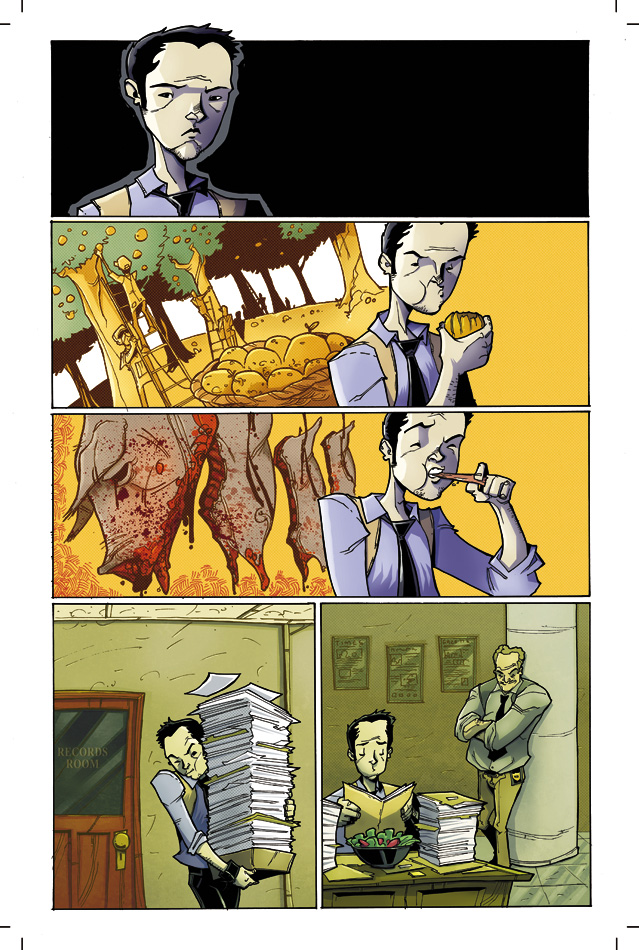
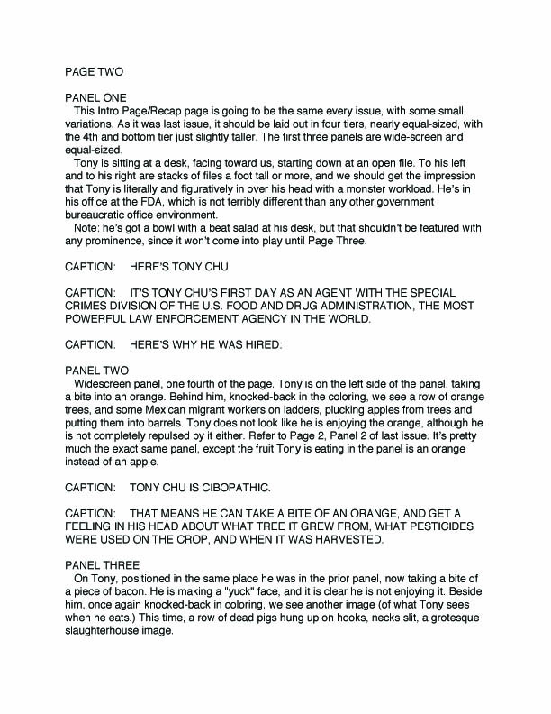
Recently the Alter Ego Comic Cast talked to John Layman, the creator and writer behind Image Comics' crazy book "Chew." It is the tale of Detective Tony Chu, who happens to be a Cibopath. Not sure what that is? That's because it's completely nuts, and totally out there freaking awesome and fun.

A Cibopath is someone who receives telepathic flashes - images, sounds, feelings, smells, tastes - of whatever he or she eats. Yeah. I won't go too far into explaining this, but allow you to seek out the first issue and find out exactly how weird and fun this idea can be.

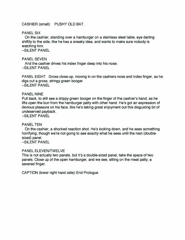
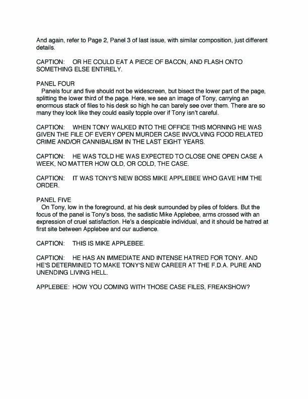
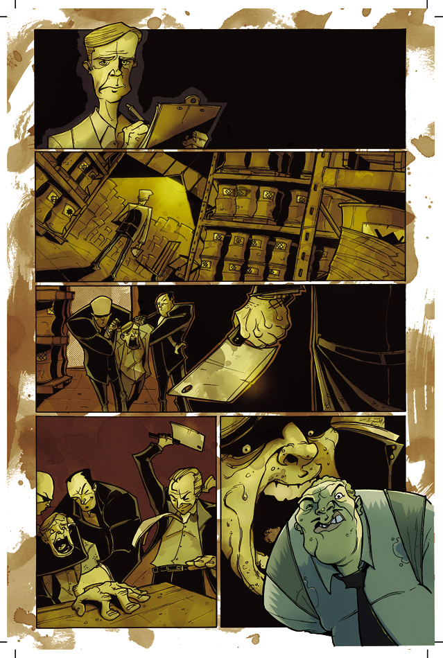
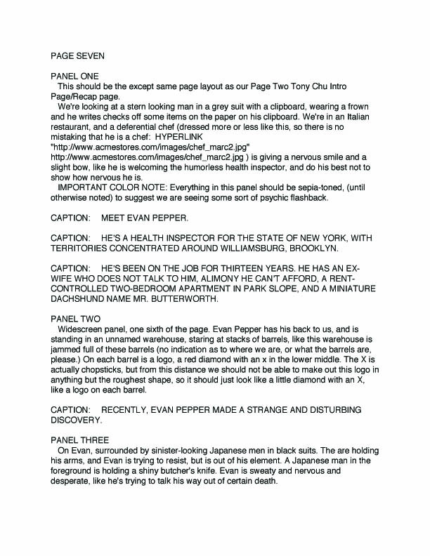
What I can do, though, is post three pages of John Layman's script from issue number two of "Chew," along with the finished art for the pages, minus dialogue. I've always loved comparing script pages with finished art, particularly in books that are written by one person and illustrated by another. The process of creating a book with two separate minds involved intrigues me to no end, and this is one way to get a unique glimpse into how exactly these awesome things called comics are made.

Huge thanks to John Layman for providing the script pages and final art work, and for doing an interview over on the Alter Ego Comic Cast. *NOTE The interview will be posted HERE*

When selecting the pages to showcase I tried to select a few that would feature a strong sense of panel progression in order to show exactly how good storytelling should work in comics, along with pages that may feature ideas or mechanisms that might seem difficult to translate into images. The artist for "Chew," Rob Guillory, demonstrates in these pages - and the rest of the comic - how to tell a good story utilizing both the words supplied by the writer, and the images supplied by a pencil or pen.

(I had to break the script pages up into two separate pieces, so you'll have to utilize multiple windows. Sorry. Also, click on the images to make them bigger.)


"Chew" Issue 2 - Page 1Chew issue 2, Pg. 1 - Part 1Chew issue 2, pg. 1 - part 2
Page 2 of "Chew" issue 2.
"Chew" issue 2, pg. 2 - part one"Chew" pg. 2 - part 2
Page 7 of "Chew" issue 2.
"Chew" issue 2, pg. 7 - part one"Chew" pg. 7 - part 2